Unrealized Gain.
11.16.21
1920x1920
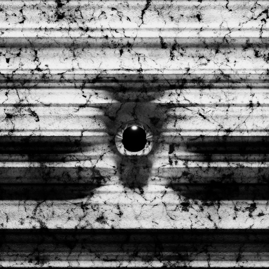
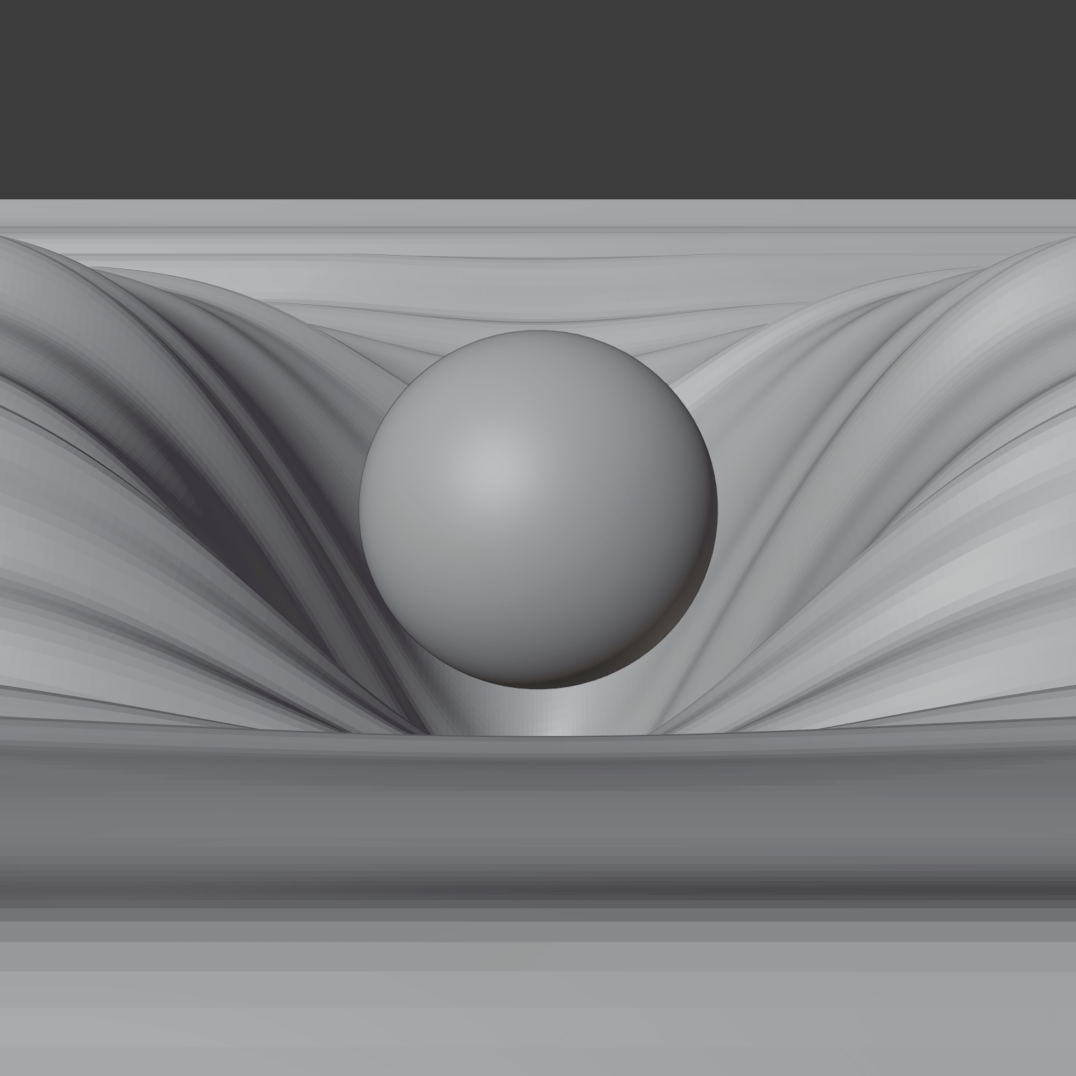
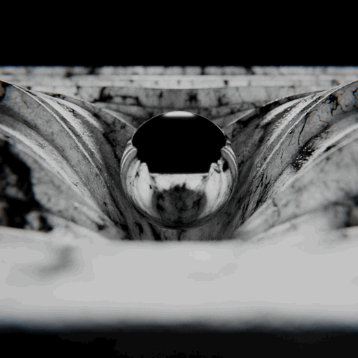
This animation is being driven by Touchdesigner - more specifically by table data which can be accessed at ccaf.io There I found measurements of the average BTC electricity consumption of the entire globe measured in TWh (terawatts per hour) from the past 10 years.
This data is extracted and randomized which is then used as (x,y) coordinate points to drive this noise. Every number you see is the corresponding amount of TWh usage of a random day ranging from 2010-2021. The higher the "jump", the higher the realized gain growth.
(It should be noted that the 4000+ samples were formatted to whole numbers, which explains why some values show up as “0”)
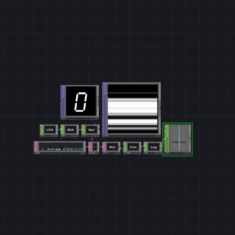
While this media is focused on the use of data which is driving the movement of the noise, it is to be understood that this is merely the "driving" factor as is shown by the numbers appearing on the top left which demonstrates the sporadic "jumps" in energy usage caused by the randomizing of the data.
The reasoning for randomizing the data is because the use of energy is a mostly linear increase factoring time and population growth, which wouldn't create the "jumping" movements I was after.
There are better ways to utilize this data and display it, but this was my first attempt at a fun way of testing TouchDesigner and using data as a control medium and combining it with Blender.
That was the initial goal of this test - to connect data with generative art.
DDD - Data Driven Design